Next: Identifying Problems Up: QoRTs Package User Manual Previous: Processing of aligned RNA-Seq Contents
Subsections
- Reading the QC data into R
- Generating all default plots
- Plotting by sample, lane, or group
- Summary Plots
- Colored by Sample
- Colored by Lane/Batch
- Colored by Group/Phenotype
- Basic Sample Highlight
- Sample Highlight, Colored by Lane
- Description of Individual Plots
- Phred Quality Score
- GC Content
- Clipping Profile
- Cigar Op Profile
- Cigar Length Distribution
- Insert Size
- N-Rate
- Gene-Body Coverage
- Cumulative Gene Diversity
- Nucleotide Rates, by Cycle
- Aligned Nucleotide Rates, by Cycle
- Leading Clipped Nucleotide Rates
- Trailing Clipped Nucleotide Rates
- Mapping location rates
- Splice Junction Loci
- Number of Splice Junction Events
- Splice Junction Event Rates per Read-Pair
- Breakdown of Splice Junction Events
- Breakdown of Splice Junction Events, by locus type
- Strandedness test
- Mapping stats
- Chromosome counts
- Normalization Factors
- Normalization Factor Ratio
- Read drop rate
- Gene Biotype Rates
- Summary Tables
Visualization
All visualization is performed the the QoRTs companion R package.
For basic QC analyses it is often not necessary to write any R code, as QoRTs comes with a simple R script that generates a standard set of png multiplots, pdf reports, and a large tab-delimited summary table. The qortsGenMultiQC.R script should be included in the scripts directory of the main package archive. This script can be run using the command:
Rscript qortsGenMultiQC.R infile/dir/ decoderFile.txt outfile/dir/
infile/dir/ should be the parent directory within which all the QC output data is contained. decoderFile.txt should be the decoder file, as described in Section 5. outfile/dir/ should be the directory where all output plots will be placed.
Alternatively, custom R code can be used to generate non-standard plots or multiplots, alter plotting parameters, or to generate plots interactively. In addition to the documentation provided in the rest of this section, the full R docs can be found online. See the github page for a link to the complete documentation.
Reading the QC data into R
First you must read in all the QC output from the java utility, using the command below. This command requires 2 arguments: a root directory and a decoder (which can be either a data frame or a file). We will be using the example data found in package QoRTexampleData, which is described in Section 5.1.
Note that the calc.DESeq2 and calc.edgeR options are optional, and tell QoRTs to attempt to load the DESeq2 and edgeR packages (respectively) and use the packages to calculate additional normalization size factors. This is not strictly needed for most purposes, but allows QoRTs to plot the normalization factors against one another. See section 7.4.23 for more information.
calc.DESeq2 = TRUE, calc.edgeR = TRUE);
Generating all default plots
To generate all the default compiled plots all at once, use the command:
This will usually take some time to run, but will produce all the compiled summary plots described in the rest of this section, including separate highlight plots for every sample in the dataset. By default all images will saved to file as pngs. There are a number of alternatives, which can be selected using the
Note: The R PDF device primarily uses vector drawings, however, some of the plots are too large to be efficiently stored as vectors. If pdf reports are desired, we recommend installing the png package. If this package is installed, then QoRTs will automatically rasterize the plotting areas of certain large plots (in particular: the gene diversity plots and the various NVC plots). Setting the
The png package can be installed with the R command:
plot.device.name parameter. For example:
makeMultiPlot.all(res, outfile.dir = "./", plot.device.name = "pdf");
#Generate svg vector drawings:
makeMultiPlot.all(res, outfile.dir = "./", plot.device.name = "svg");
rasterize.large.plots parameter to FALSE will deactivate this behavior. The raster.height and raster.width parameters can be used to increase the pixel resolution of the rasterized plotting regions, if desired.
Plotting by sample, lane, or group
QoRTs includes automated methods for organizing and plotting the results in numerous different ways. The intent of these tools is to make any patterns and biases more visible to the user.
All plotting functions in QoRTs require a QoRTs_Plotter object. A QoRTs_Plotter is a RefClass object that contains all the QC data along with a set of parameters that determine how to color and draw each replicate's data. A full accounting of all possible options available in the is beyond the scope of this manual, but can be found in the help docs for the QoRTs_Plotter class.
Summary Plots
The most basic QoRTs_Plotter can be created using the command:
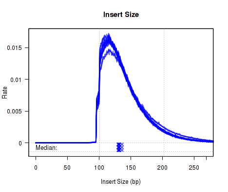
This QoRTs_Plotter object can be used to plot all replicates on top of one another in semi-transparent blue. For example:
Which produces Figure 1:
The above example plot displays the "Insert Size" of each replicate, as described in Section 7.4.6.
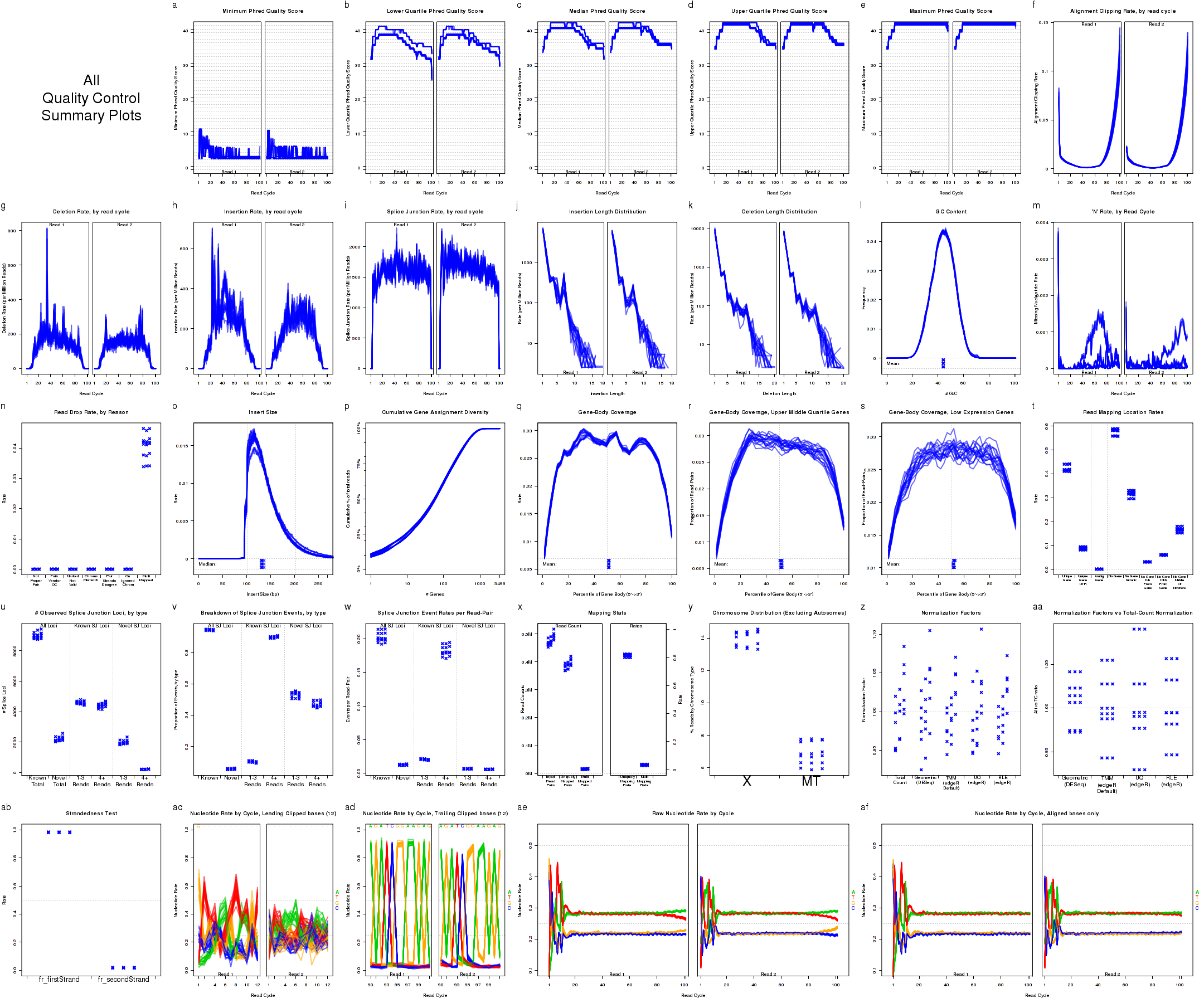
In addition, a compiled multi-plot in this style, containing all the standard QC plots, can be generated with the command:
Which produces Figure 2:
This plot includes many sub-plots, all in a single frame. The sub-plots are:
A printable pdf version of this multi-plot, with 6 plots on each page, can be generated with using the options:
Colored by Sample
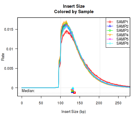
For small datasets, it can be useful to simply color each sample a distinct color, so that outliers can be easily identified. For this, you first generate a QoRTs_Plotter using the command:
This QoRTs_Plotter can be used to draw all the replicate on top of one another, but color them based on their sample.ID. The plotter can then be used to create various QC plots, for example:
Which produces Figure 3:
The above example plot displays the "Insert Size" of each replicate, as described in Section 7.4.6.
In addition, a compiled multi-plot in this style, containing all the standard QC plots, can be generated with the command:
makePlot.legend.over("topright",bySample.plotter);
Colored by Lane/Batch
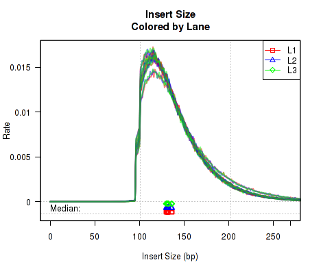
In order to more easily detect batch effects, it is possible to color each replicate by lane/batch. For this, you can generate a QoRTs_Plotter with the command:
This QoRTs_Plotter can be used to color replicates based on lane.ID. The QoRTs_Plotter can then be used to create various QC plots, for example:
Which produces Figure 4:
The above example plot displays the "Insert Size" of each replicate, as described in Section 7.4.6.
In addition, a compiled multi-plot in this style, containing all the standard QC plots, can be generated with the command:
makePlot.legend.over("topright",byLane.plotter);
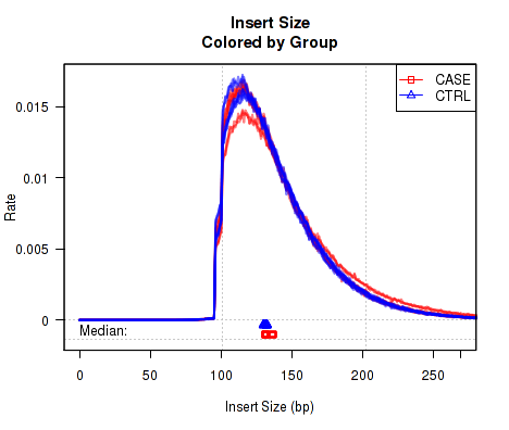
Colored by Group/Phenotype
To detect variations caused by biological conditions (or artifacts and errors that occur disproportionately in certain biological conditions), it is sometimes useful to color samples by group.ID.
This QoRTs_Plotter can then be used to create various QC plots, for example:
Which produces Figure 5:
The above example plot displays the "Insert Size" of each replicate, as described in Section 7.4.6.
In addition, a compiled multi-plot in this style, containing all the standard QC plots, can be generated with the command:
makePlot.legend.over("topright",byGroup.plotter);
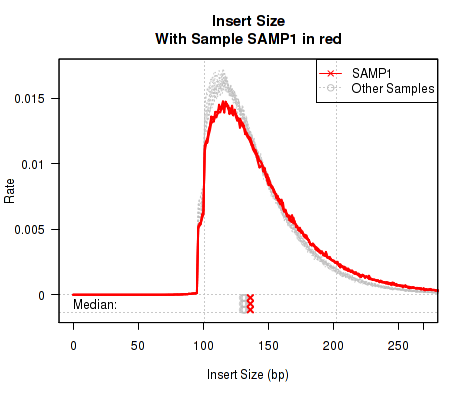
Basic Sample Highlight
Sometimes it is useful to "highlight" an individual sample.
This QoRTs_Plotter can then be used to create various QC plots, for example:
Which produces Figure 6:
The above example plot displays the "Insert Size" of each replicate, as described in Section 7.4.6.
In addition, a compiled multi-plot in this style, containing all the standard QC plots, can be generated with the command:
makePlot.legend.over("topright",sample.SAMP1.plotter);
curr.sample = "SAMP1");
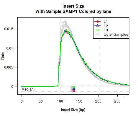
Sample Highlight, Colored by Lane
Sometimes it can be useful to highlight an individual sample. However, if that sample has multiple "technical replicates" (derived from multiple separate lanes/runs on the same library), it can be useful to color the different runs with different distinct colors. With this plotter, only the "highlighted" sample is colored, all other samples are colored Gray.
This QoRTs_Plotter can then be used to create various QC plots, for example:
Which produces Figure 7:
The above example plot displays the "Insert Size" of each replicate, as described in Section 7.4.6.
In addition, a compiled multi-plot in this style, containing all the standard QC plots, can be generated with the command:
build.plotter.highlightSample.colorByLane("SAMP1",res);
makePlot.legend.over("topright",sample.SAMP1.colorByLane.plotter);
curr.sample = "SAMP1");
Description of Individual Plots
QoRTs is capable of producing a wide variety of different plots and graphs. While most of these plots will not be particularly interesting or informative in the majority of cases, they may reveal artifacts or errors if and when they occur.
The example plots in the following section all use the byLane.plotter QoRTs_Plotter (from Section 7.3.3), which colors each replicate by its lane ID.
Phred Quality Score
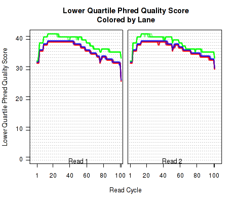
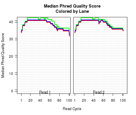
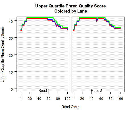
The plots shown in Figure 8 displays information about the phred quality score (y-axis) as a function of the position in the read (x-axis). Five statistics can be plotted: minimum, maximum, upper and lower quartiles, and median. These statistics are calculated individually for each replicate and each read position (ie, each plotted line corresponds to a replicate).
Note that the Phred score is always an integer, and as such these plots would normally be very difficult to read because lines would be plotted directly on top of one another. To reduce this problem, the plots are vertically offset from one another.
These plots can be generated individually with the commands:
Additional options (Not shown):
makePlot.qual.pair(byLane.plotter,"median");
makePlot.qual.pair(byLane.plotter,"upperQuartile");
makePlot.qual.pair(byLane.plotter,"max");
GC Content
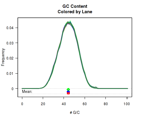
For each replicate, Figure 9 displays a histogram showing the frequency that different proportions of G and C (versus A, T, and N) appear in the replicate's reads. Each plotted line corresponds to a replicate. At the bottom of the plot the mean average G/C content is also plotted. Once again, the means are offset from one another by lane, to allow for easy detection of batch effects.
This plot can be generated individually with the command:
The
byPair option can be used to calculate the GC-distribution for read-pairs rather than for all reads individually. This is disabled by default because it often results in a jagged distribution when a appreciable proportion of the reads have an insert size equal to or smaller than the read length. When this occurs, the read-pair will almost always have an even number of G/C nucleotides.
Clipping Profile
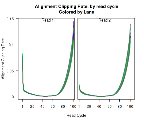
For each replicate, Figure 10 displays the rate (y-axis) at which the aligner soft-clips the reads as a function of read position (x-axis). Note that this will only be informative when using aligners that are capable of soft-clipped alignment (such as RNA-Star or GSNAP, but not TopHat).
This plot can be generated individually with the command:
Cigar Op Profile
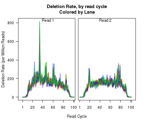
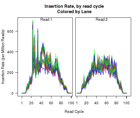
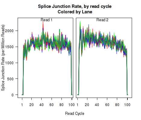
For each replicate, Figure 11 displays the rate (y-axis) of various cigar operations as a function of read position (x-axis). All 9 legal cigar operations can be plotted, but for most purposes only Deletions, Insertions, and Splice junctions will be informative.
This plot can be generated with the command:
makePlot.cigarOp.byCycle(byLane.plotter, "Ins");
makePlot.cigarOp.byCycle(byLane.plotter, "Splice");
Cigar Length Distribution
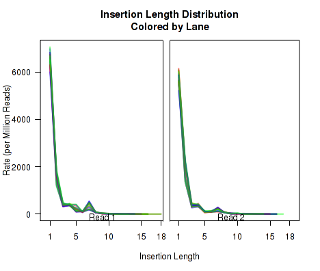
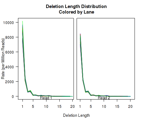
The plots in Figure 12 display histograms of cigar operation lengths for each replicate.
These plots can be generated individually with the commands:
makePlot.cigarLength.distribution(byLane.plotter, "Del")
Insert Size
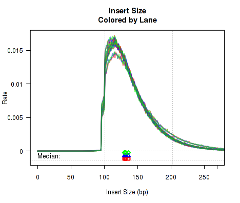
For each replicate, Figure 13 displays a histogram of the "insert size". Each line corresponds to one replicate, and displays the rate (y-axis) at which that replicate's reads possess a given insert size (x-axis).
Definition: "Insert Size": The "insert size" is the length (in base-pairs) between the two sequencing adapters for a pair of paired-end reads. In other words, it is the size of the original RNA fragment.
Insert Size Estimation: The Insert size is calculated using the alignment of the paired reads. When the two paired reads are aligned such that they overlap with one another the insert size can be calculated exactly. In such cases, the calculation of the insert size does not depend on the transcript annotation. However, when there is no overlap the exact insert size can be uncertain. Multiple splice junctions may lie in the region between the endpoints of the two paired reads, and there is no real way to determine which junctions the fragment used, if any. QoRTs uses the set of all splice junctions found between the endpoints of the two reads, and uses the shortest possible path from endpoint to endpoint. In some cases this may under-estimate the insert size, as the actual path may not be the shortest possible path. In other cases this may also over-estimate the insert size, if the RNA fragment includes novel splice junctions not found in the transcript annotation. However, in most cases this method appears to produce a reasonably good approximation of the insert size.
Note that the median average insert sizes for each replicate are plotted below the main plot. Each point corresponds to one replicate.
This plot can be generated individually with the command:
Note: If the dataset is single-ended, this will generate a placeholder plot.
N-Rate
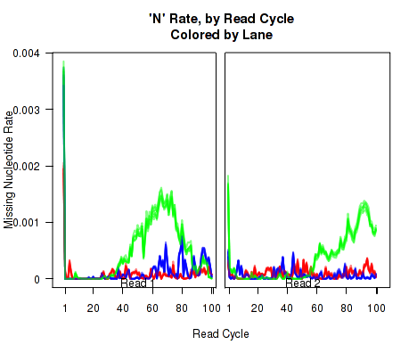
Figure 14 displays the rate (y-axis) at which the read sequence is "N" (or "missing"), as a function of the read position (x-axis). Each line corresponds to one replicate.
This plot can be generated individually with the command:
Gene-Body Coverage
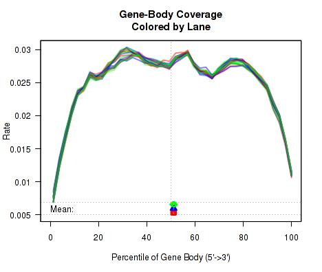
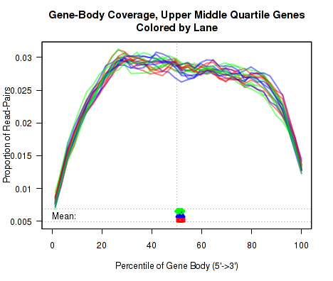
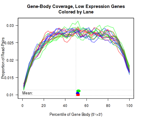
For each replicate, the leftmost plot of Figure 15 displays the coverage profile across quantiles of all genes' lengths, from 5' to 3'. The middle plot displays the coverage profile for only the genes that are in the upper-middle quartile by read-count. The leftmost plot displays the coverage profile for the genes that are in the two lower quartiles.
Minor notes: To calculate the coverage profile, all the transcripts for each gene are merged together into a single "flat" pseudo-transcript which contains all exonic regions belonging to the gene. For each gene, the pseudo-transcript is broken up into 40 equal-length counting bins, so that each bin contains 2.5% of the total gene length. Each read-pair is counted once for every counting bin with which it overlaps. Genes are excluded from this analysis if they overlap with other genes or if they have zero reads for a given replicate. Additionally, any reads that overlap with more than one gene are automatically excluded.
This plot can be generated individually with the command:
makePlot.genebody(byLane.plotter, geneset="50-75");
makePlot.genebody(byLane.plotter, geneset="0-50");
Cumulative Gene Diversity
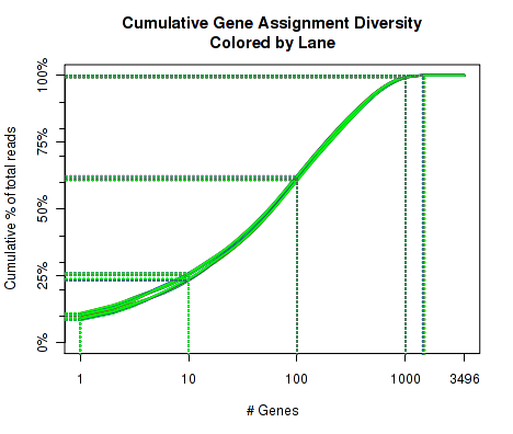
For each replicate, Figure 16 displays the cumulative gene diversity. For each replicate, the genes are sorted by read-count. Then, a cumulative function is calculated for the percent of the total proportion of reads as a function of the number of genes. Intercepts are plotted as well, showing the cumulative percent for 1 gene, 10 genes, 100 genes, 1000 genes, and 10000 genes.
So, for example, across all the replicate, around 50 to 55 percent of the read-pairs were found to map to the top 1000 genes. Around 20 percent of the reads were found in the top 100 genes. And so on. This can be used as an indicator of whether a large proportion of the reads stem from of a small number of genes. Note that this is restricted to only the reads that map to a single unique gene. Reads that map to more than one gene, or that map to intronic or intergenic areas are ignored.
This plot can be generated individually with the command:
Nucleotide Rates, by Cycle
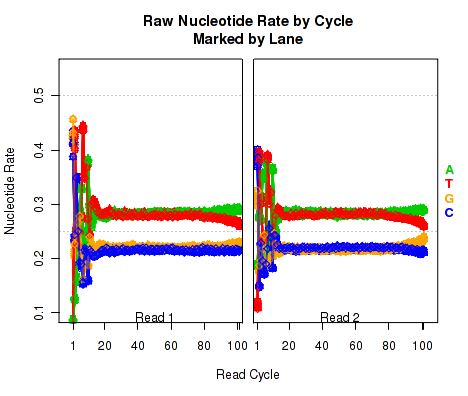
For each replicate, Figure 17 displays the rate at which each nucleotide appears (y-axis), as a function of the position in the read (x-axis). The color scheme for NVC plots is different from the other plots. Rather than being used for emphasis or to allow cross-comparisons by sample, biological-condition, or lane, the colors are used to indicate the four nucleotides: A (green), T (red), G (orange), or C (blue). Depending on the type of plotter being used, sample-runs will be marked and differentiated by marking the lines with shapes (R points). In many cases the points will be unreadable due to overplotting, but clear outliers that stray from the general trends can be readily identified.
When used with a "sample.highlight" type plotter (see 7.3.5), "highlighted" samples will be drawn with a deeper shade of the given color.
This plot displays the "raw" nucleotide rates, including bases that are soft-clipped by the aligner.
This plot can be generated individually with the command:
Aligned Nucleotide Rates, by Cycle
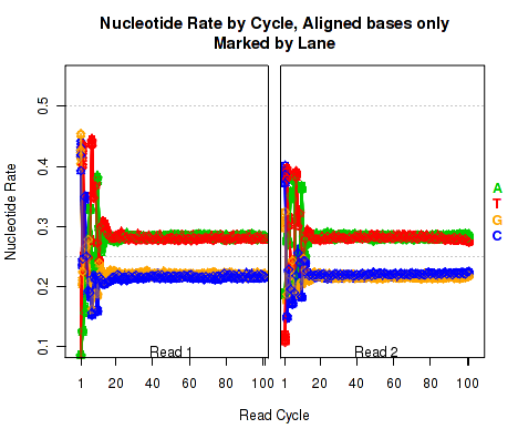
Figure 18 is identical to Figure 17 (described in section 7.4.10), except that it only counts bases that are not soft clipped off by the aligner.
This plot can be generated individually with the command:
Leading Clipped Nucleotide Rates
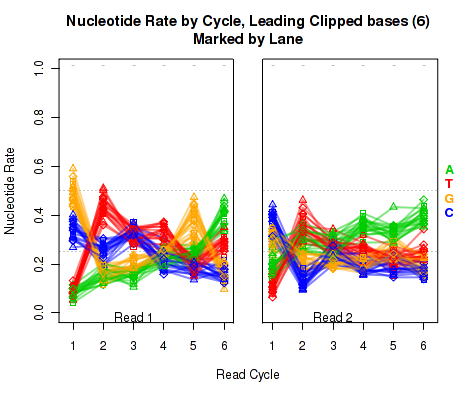
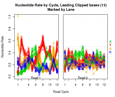
The left plot in Figure 19 displays the nucleotide rate (y-axis) as a function of read position (x-axis), for the first 6 bases of reads in which exactly 6 bases were clipped off the 5' end. The right plot displays the nucleotide rate (y-axis) as a function of read position (x-axis), for the first 12 bases of reads in which exactly 12 bases were clipped off the 5' end.
This plot can be generated individually with the command:
Any integer can be used as the
makePlot.NVC.lead.clip(byLane.plotter, clip.amt = 12);
clip.amt value.
Trailing Clipped Nucleotide Rates
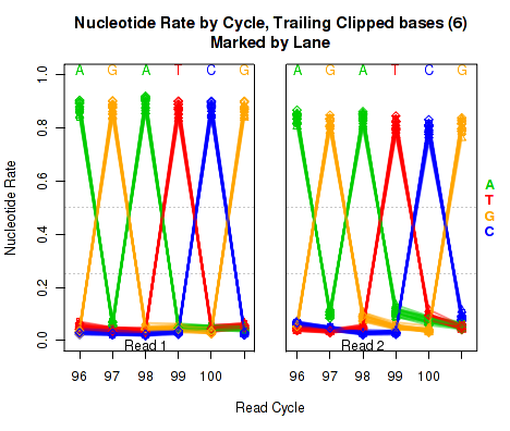
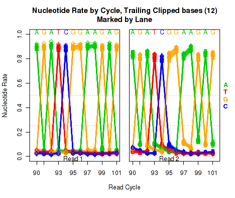
The left plot in Figure 20 displays the nucleotide rate (y-axis) as a function of read position (x-axis), for the last 6 bases of reads in which exactly 6 bases were clipped off the 3' end. The right plot displays the nucleotide rate (y-axis) as a function of read position (x-axis), for the last 12 bases of reads in which exactly 12 bases were clipped off the 3' end.
Note concerning the example data: In the example dataset an extremely strong trend is easily visible. The specific sequence observed matches that of the sequencing adapter used. The pattern appears in reads coming from fragments that are smaller than the read length. In these cases, the 3' end of each read will continue into the adapter sequence after sequencing the entire template fragment. Thus: for the left and right plots the sequence comes from reads with an insert size of exactly 95 and 89, respectively (ie 101 base pairs minus 6 or 12).
These plots can be generated individually with the command:
Any integer can be used as the
makePlot.NVC.tail.clip(byLane.plotter, clip.amt = 12);
clip.amt value.
Mapping location rates
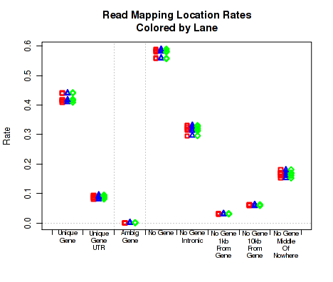
For each replicate, Figure 21 displays the rate (y-axis) for which the replicate's read-pairs are assigned to the given categories.
The categories are:
This plot can be generated individually with the command:
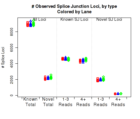
For each replicate, Figure 22 displays the number (y-axis) of splice junction loci of each type that appear in the replicate's reads. Splice junctions are split into 4 groups, first by whether the splice junction appears in the transcript annotation gtf ("known" vs "novel"), and then by whether the splice junction has 4 or more reads covering it or 1-3 reads.
The six categories of splice junction locus are:
This plot can be generated individually with the command:
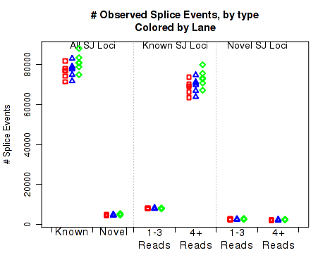
For each replicate, Figure 23 displays the number (y-axis) of all splice junction events falling into each of the six junction categories. A splice junction "event" is one instance of a read-pair bridging a splice junction. Some reads may contain multiple splice junction events, some may contain none. If a splice junction appears on both reads of a read-pair, this is still only counted as a single "event".
Note that because different samples/runs may have different total read counts and/or library sizes, this function is generally not the best for comparing between samples. In general, the event rates per read-pair should be used, see the next section, 7.4.17.
This plot is used to detect whether sample-specific or batch effects have a substantial or biased effect on splice junction appearance, either due to differences in the original RNA, or due to artifacts that alter the rate at which the aligner maps across splice junctions.
This plot can be generated individually with the command:
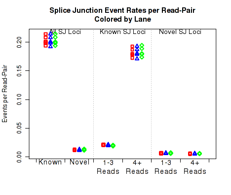
For each replicate, Figure 24 displays the rate, per read-pair, (y-axis) at which each type of splice junction events appear. This is equivalent to the results seen in 7.4.16, except that each sample is scaled by the number of reads belonging to that sample.
This plot can be generated individually with the command:
This plot is used to detect whether sample-specific or batch effects have a substantial or biased effect on splice junction appearance, either due to differences in the original RNA, or due to artifacts that alter the rate at which the aligner maps across splice junctions.
This plot can be generated individually with the command:
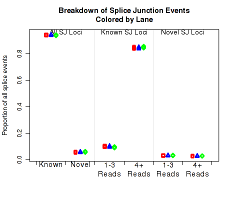
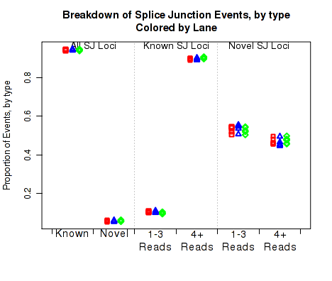
In Figure 26 the left two columns display the proportion of splice junction events that are known vs novel. The middle columns display the proportion of known splice junction events that bridge junctions that have high (more than 4) vs low (1-3) read-pairs covering them. The right two columns display the proportion of novel splice junction events that bridge junctions that have high (more than 4) vs low (1-3) read-pairs covering them.
This plot can be generated individually with the command:
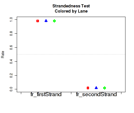
Figure 27 displays the rate at which reads appear to follow the two possible library-type strandedness rules. (See section 6 for more information on stranded library types).
This plot is used to detect whether your data is indeed stranded, and whether you are using the correct stranded data library type option. For unstranded libraries, one would expect all points to fall very close to the 50-50 center line. For stranded libraries, all points should fall closer to 99
This plot can be generated individually with the command:
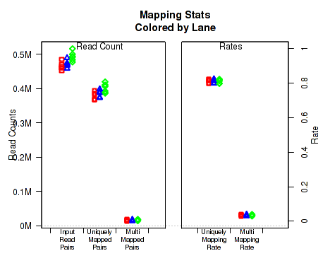
For each replicate, Figure 28 displays the mapping rates and counts. In order to plot this data, QoRTs must be provided with the pre-alignment read-count for each replicate. There are a number of ways to provide this information to QoRTs. The easiest method is to list it specifically in the replicate decoder (see Section
If the dataset contains multi-mapped reads, then numbers and rates of multi-mapping will be included in this plot. If multi-mapped reads were filtered out of the dataset prior to analysis with QoRTs, the multi-mapping rates can still be specified explicitly using the decoder (see Section
This plot can be generated individually with the command:
If the input read count or multi-mapped count information is not found, this will generate a placeholder plot.
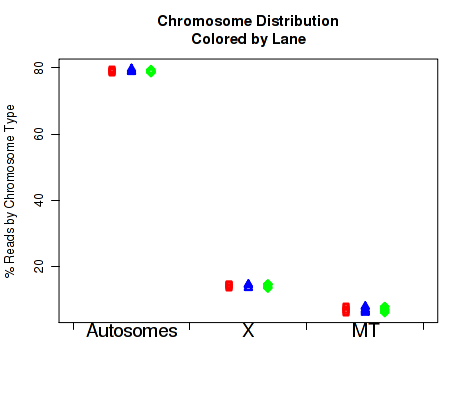
For each replicate, Figure 29 displays the number of read-pairs mapping to each category of chromosome.
The chromosome.name.style must be set to match the style of your chromosome names. By default it assumes the chromosomes are named chr1, chr2, chr3, etc.
For more information, see the help document using the command help(makePlot.chrom.type.rates).
This plot can be generated individually with the command:
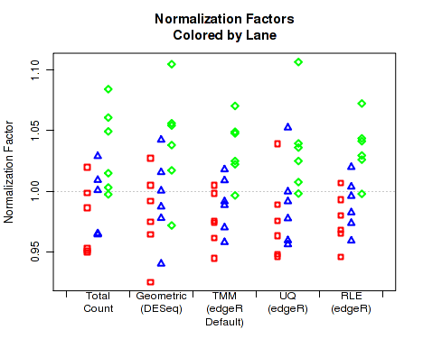
For each replicate, Figure 30 displays the normalization factors.
By default, QoRTs will automatically detect whether DESeq2 and edgeR are installed and will use these tools to calculate their respective normalization size factors. If neither package is found, then it will only plot the total count normalization.
This plot can be generated individually with the command:
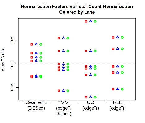
For each replicate, Figure 31 displays the ratio of the alternate normalization factors to the Total Count normalization factors.
By default, QoRTs will automatically detect whether DESeq2 and edgeR are installed and will use these tools to calculate their respective normalization size factors. If neither package is found, then it will only plot the total count normalization.
This plot can be generated individually with the command:
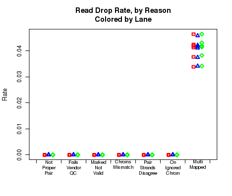
For each replicate, Figure 32 displays the rates and reasons for reads being dropped from QC analysis. Note that in the example dataset reads were never dropped. This is a consequence of the pre-processing steps in the example pipeline.
This plot can be generated individually with the command:
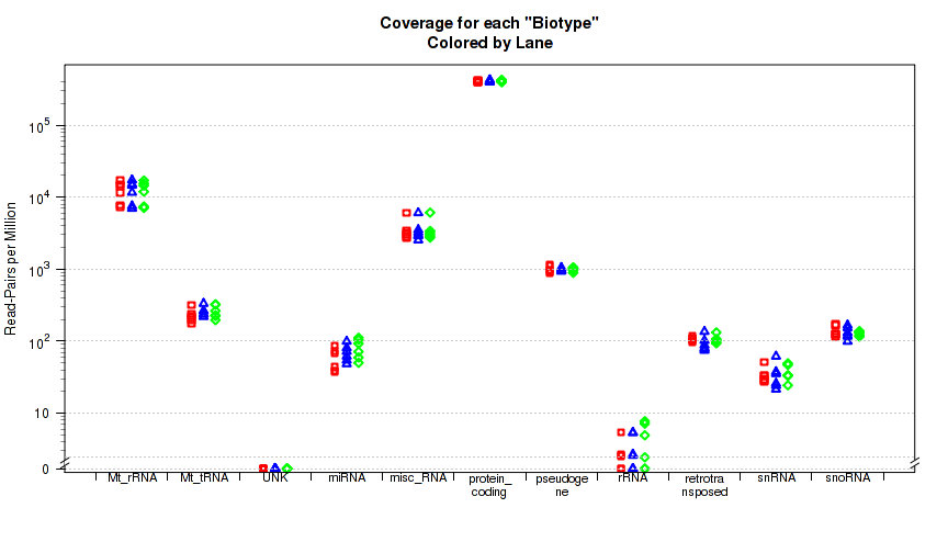
This plot is not in the standard battery of plots, as it requires special preparation to use. For each replicate, Figure 33 displays the proportion of gene-mapped reads that intersect with each gene "BioType" as listed in the original GTF annotation file.
The "biotype" is pulled from the GTF annotation file using the optional "
This plot can be generated with the command:
In addition to plots, QoRTs can also compile a useful summary table, including summary information across many metrics:
Additionally, size factors used for normalization can be outputted to file:
Note that by default,
These size factors are used extensively in latter sections of this vignette to generate normalized coverage browser tracks.
Splice Junction Loci
Number of Splice Junction Events
Splice Junction Event Rates per Read-Pair
Breakdown of Splice Junction Events
Breakdown of Splice Junction Events, by locus type
Strandedness test
Mapping stats
![[*]](crossref.png) ). Alternatively, this information can be provided at the initial processing stage (see Section 6), either by setting the input read count explicitly using the
). Alternatively, this information can be provided at the initial processing stage (see Section 6), either by setting the input read count explicitly using the --seqReadCt parameter, or by providing one of the unaligned fastq files via the --rawfastq parameter, in which case the input read count is calculated simply by dividing the number of lines in the fastq file by 4. For paired-end data, only one of the two fastq files needs to be provided, as both will have the same number of reads.
).
Chromosome counts
Normalization Factors
Normalization Factor Ratio
Read drop rate
Gene Biotype Rates
gene_biotype" attribute tag. This is the tag identifier used by Ensembl in their annotations. This separates RNA transcripts into categories such as protein coding mRNAs, lncRNAs, rRNAs, and so on. Unfortunately there are
dozens if not hundreds of different ways to encode this sort information for various species and institutions,
and unlike many other features no common standard has yet appeared. If you need
to include this sort of information, you will need to edit the annotation GTF file yourself.
You only need to mark the rRNA fields yourself. Any genes that do not have a gene_biotype field will simply be assigned the "UNK" biotype, so you only need to add the
biotypes that you are interested in testing.
Summary Tables
##   sample.ID size.factor
## 1     SAMP1       1.058
## 2     SAMP2       1.000
## 3     SAMP3       1.015
## 4     SAMP4       0.946
## 5     SAMP5       1.025
## 6     SAMP6       0.986
get.size.factors requires DESeq2. You can use simpler total-count-based size factors by setting sf.method to "TC".
![]()
![]()
![]()
![]()
Next: Identifying Problems
Up: QoRTs Package User Manual
Previous: Processing of aligned RNA-Seq
Contents
Dr Stephen William Hartley
2015-11-06